W O R K P R O C E S S
Mia & More
“Mia” is a Vietnamese word meaning sugarcane – main ingredient of their signature drink , the word “More” suggest that there are also other add-ins.
The process provided below will give you a clear picture of how the work of a typical project is carried out.
Most of my work is “backstage” processes, from studying the textures and the natural effects that may be involved to acquiring background knowledge about the products. These tasks are unseen yet very important and directly affect our output. This helps make every small feature more valuable, having its own intention and meaning.
REQUIREMENT
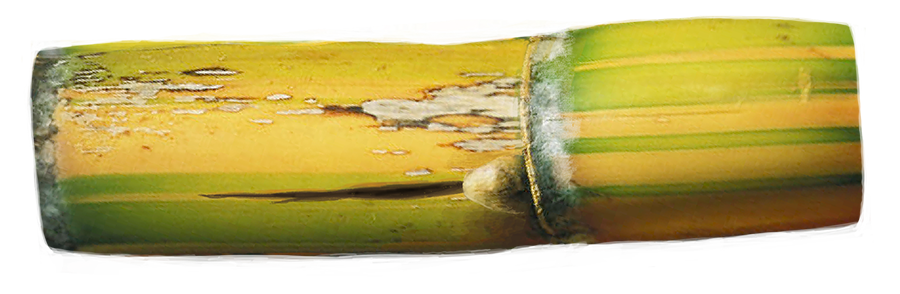
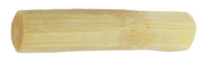
SUGARCANE
Typical form of sugarcane with its natural characteristics
PACKAGE
Simple shape form, easy to print to any place
TROPICAL
Summer mood, fresh feeling, bring happiness
1. RESEARCH
SUGARCANE


LETTER STYLE & LAYOUT
The letters should have joyful, tropical vibe. However, to assure the readability, they also need to be plain and clear.
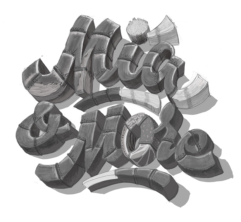
By stacking 2 words “Mia” and “More”, I created a solid circle shape. The form is now neat and can be surely utilized as a logo or stickers. Imagine if the word is in one line, the form’s width will excess its height. The logo then become a rectangle, which is harder to place than a square.
The lowercase letter is chosen to bring the natural feeling, and comfortable to read. We still need to keep the M in capital to emphasis the logo. If the words are all in caps, they will create a heavy feeling for our theme.
STYLE 1
Style : Script/ Hand writing
Free, generous and friendly
High contrast of letter’s stroke, which is made by the flow of going up and down, creates a high readability level, it helps the logo more noticeable in real life.
Layout : Curve layout
Smooth, natural feeling
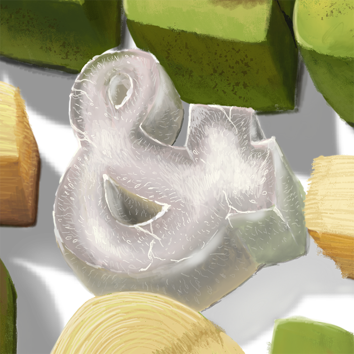
The symbol “&” between 2 letters connects those words and tightens the overall layout


STYLE 2
Style : San Serifs (letters with foot)
Joyful, interesting, generous feeling
In bold , easy to read, looks good in the distance , and clear even in very small printing area ( Eg website title, paper cup,…)
Layout : Wave layout
Wavy, tropical, softly
The logo is shaped as a big circle to show the smooth of the mood.
A slant angle (Italic letter style) brings the nature feeling of handwriting and to better reflect the mood.


2. CONCEPT
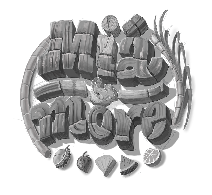
BLACK AND WHITE
After being done researching, we put those textures and details accomplishing with the solid style letters to be a completely unification.
Now it literally shows the connection of Sugarcane stem and other parts. The pattern, scratch … everything is now clear in a 3D form.
Natural light effect has been created, which leaves a perspective artwork with more depth. 3 areas includes the light side, the shadow side, and the cast shadow on the ground.
CONCEPT 1
CONCEPT 2
COLOR
Base on the black and white version, we pick color theme for each concepts. The color theme not only shows the real appearance of a sugarcane but also creates the mood we need.


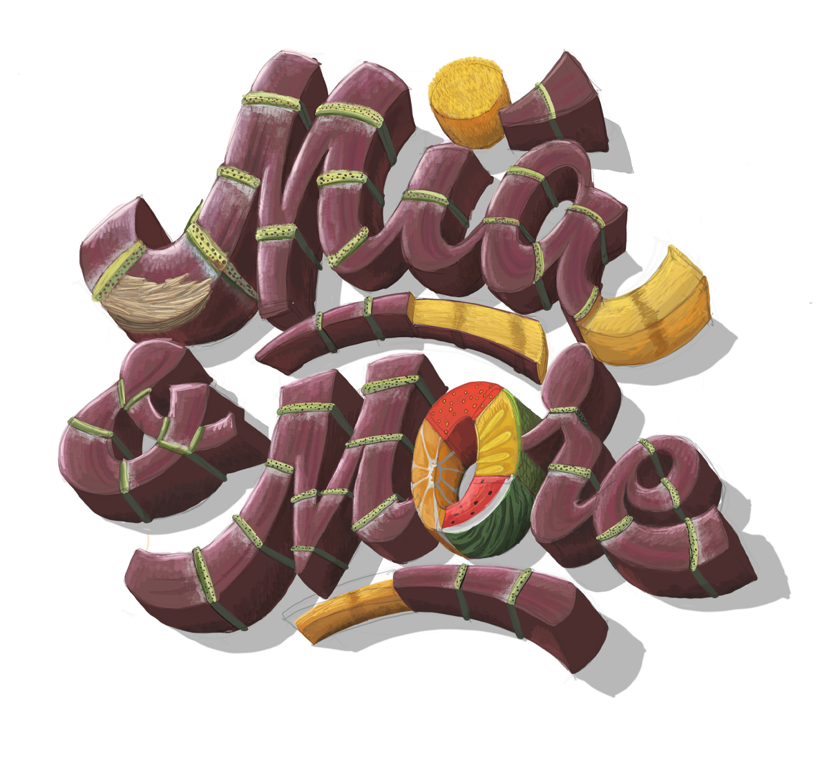
DARK RED SUGARCANE and the specification of details ( results from RESEARCHING )
1. Green growth ring
2. White dust ring (pollen ring)
3. Leaf sheath
4.Root dot (Root primordia)
5. Bud
The core inside was cut and connected to the main stem.
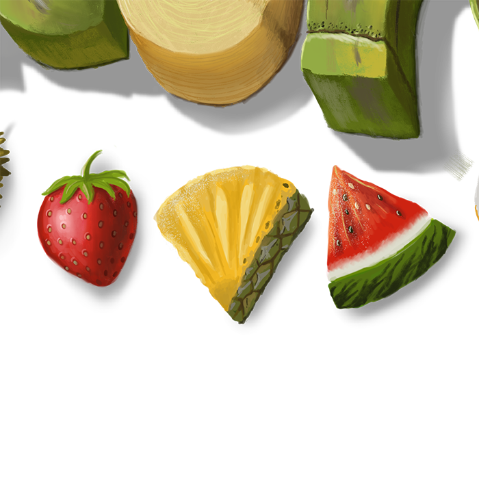
Letter O was stuffed up with sub ingredients to the juice (pieces of orange, strawberry, pineapple, and watermelon)..


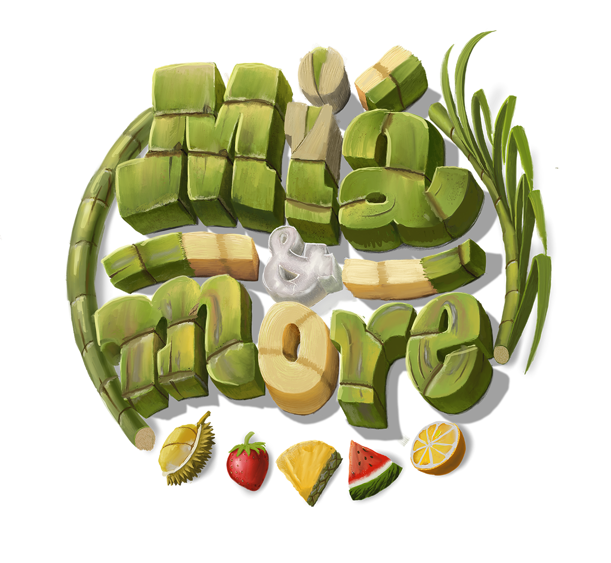
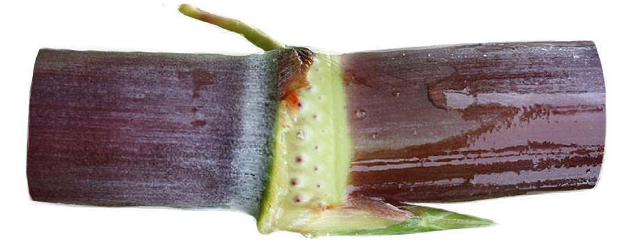
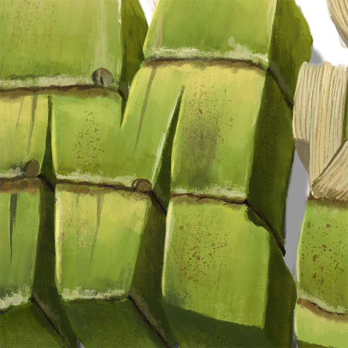
FRESH GREEN SUGARCANE and the specification of details ( results from RESEARCHING )
2. White dust ring (pollen ring)
3. Leaf sheath
4. Root dot (Root primordia)
5. Bud
6. Scratch
7. Brown growth ring
8. Crack
9. Stripe
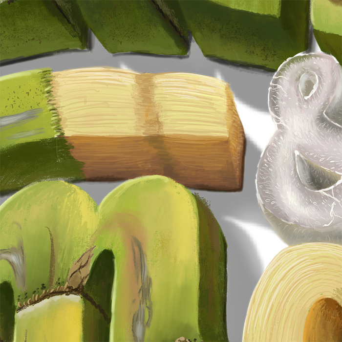
Ice texture is added to bring the cool and fresh feeling in the middle of the artwork.
Letter “O” is made by sugarcane’s core and 2 other peeled sections all point to the “&”.
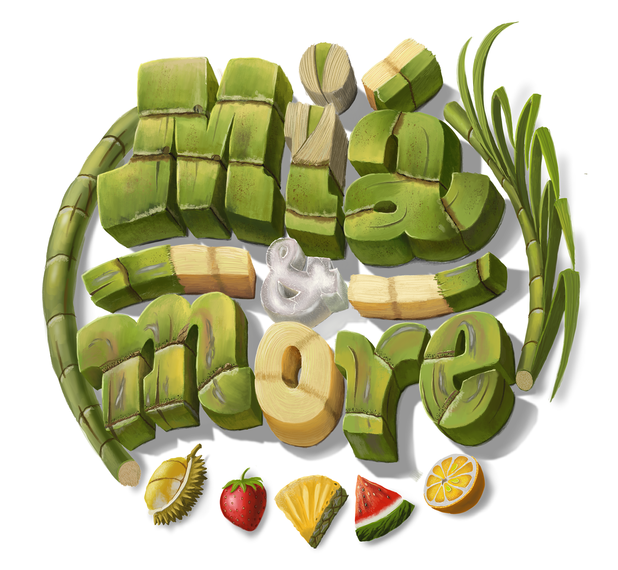
The customer chooses the CONCEPT 2, we are going to modify all the rough details to complete the artwork.
3. COMPLETE
The complete version with the precise detail.
Pinch to zoom


PREMIUM PACKAGE
DOUBLE PRICE, TRIPLE QUALITY
If you want something more special, go for Ultrasharp PREMIUM PACKAGE. It is assured to obtain highest level of details with 9k Resolution, multiple smallest specifications of details.