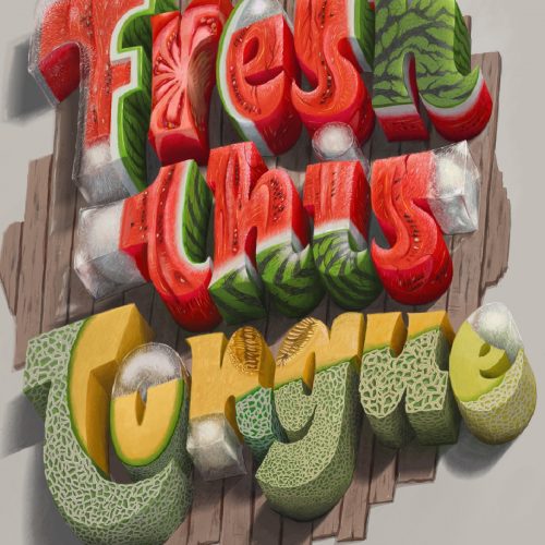
FRESH THIS TONGUE
TASTE LIKE TROPICAL
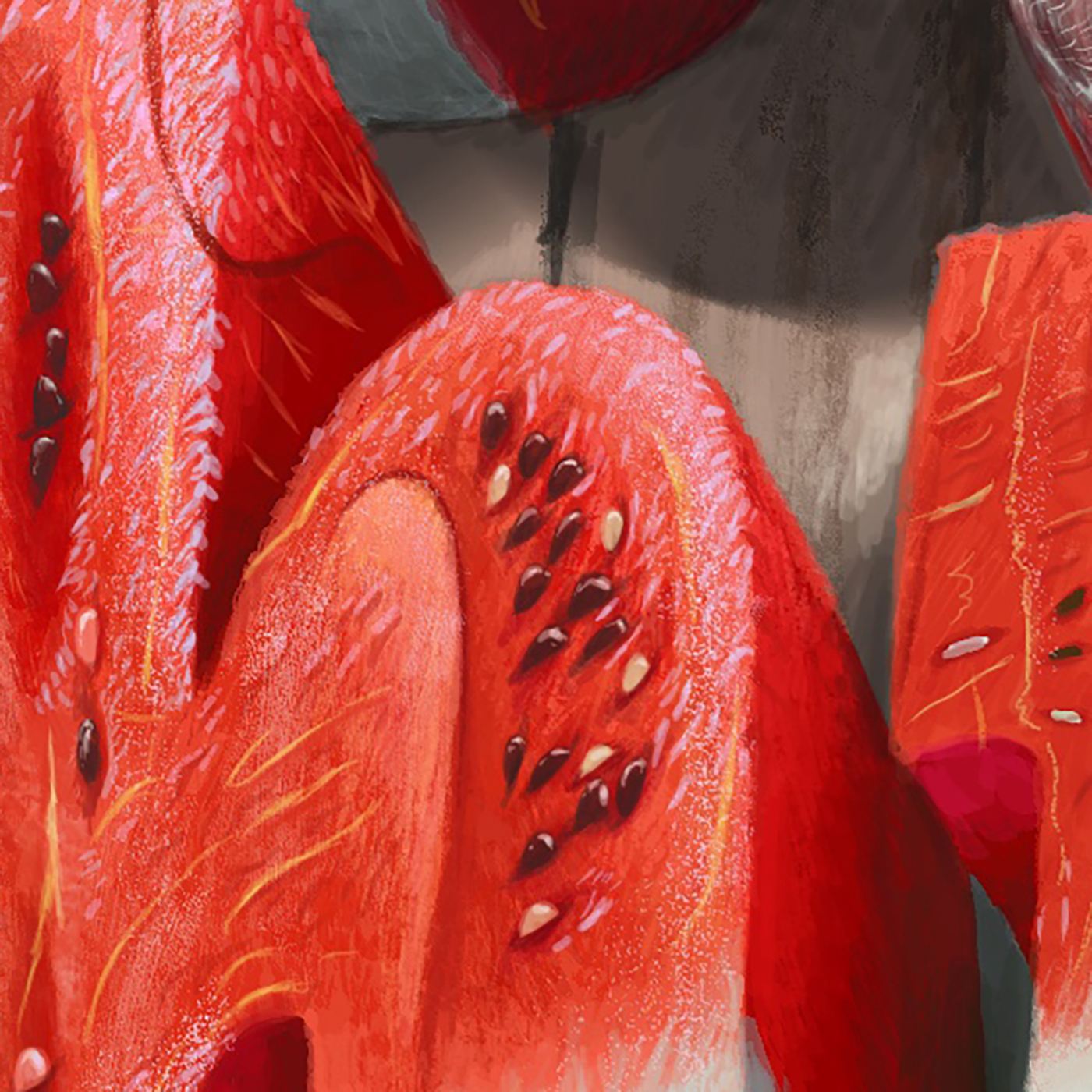
Tropical colors are displayed through the freshnetss of watermelon and ice. Combined with the sharp details with 8K resolution makes the smallest details like the seeds are also precisely drawn.
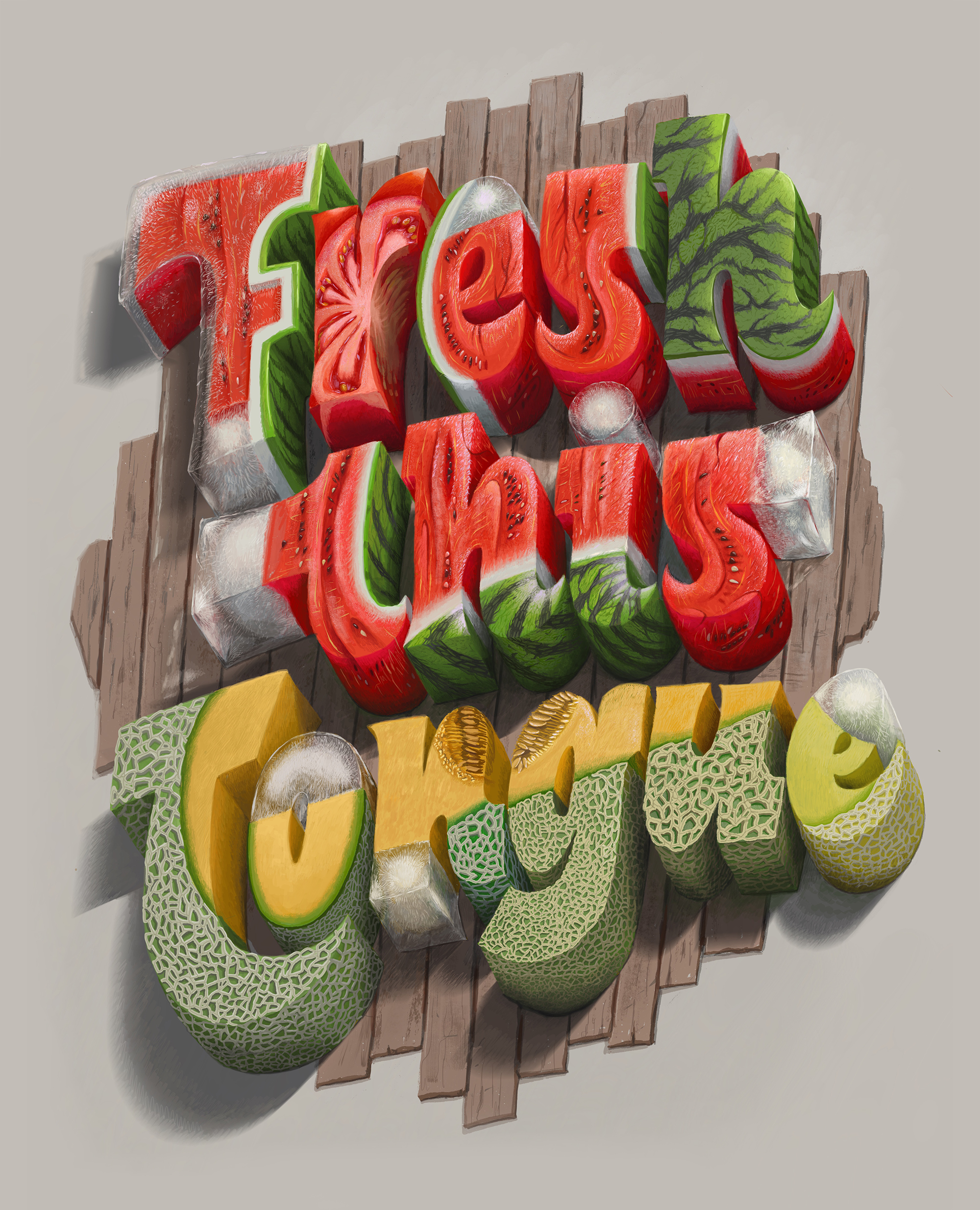
Pinch to zoom
(this version is fixed in PC or laptop browser with the high quality. But when you are in the Mobile or the Tablet mode, you can pinch to zoom the smaller detail)
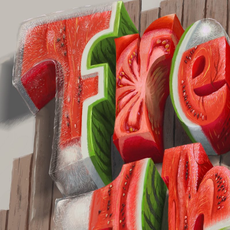
1. THE MELONS
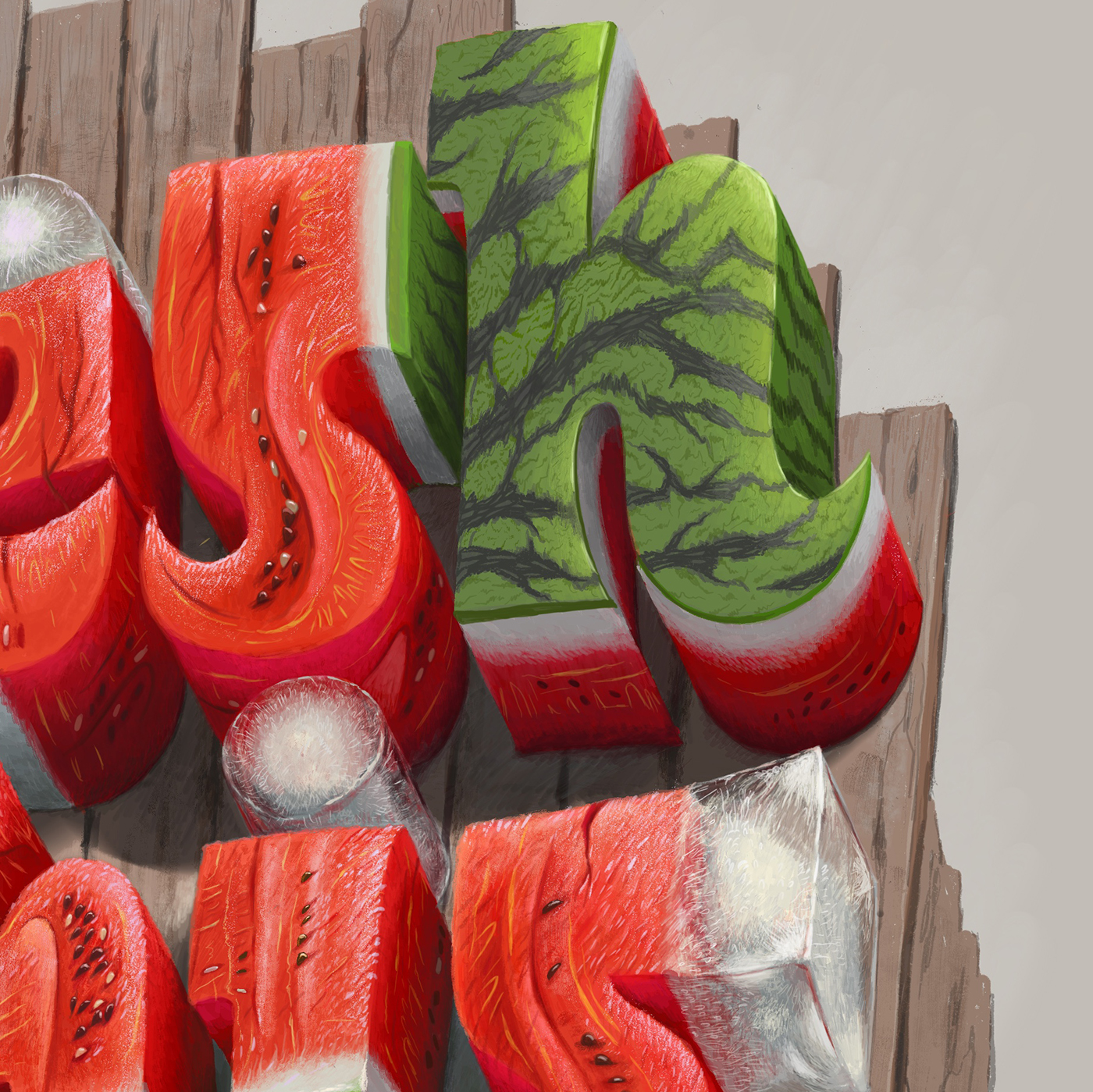
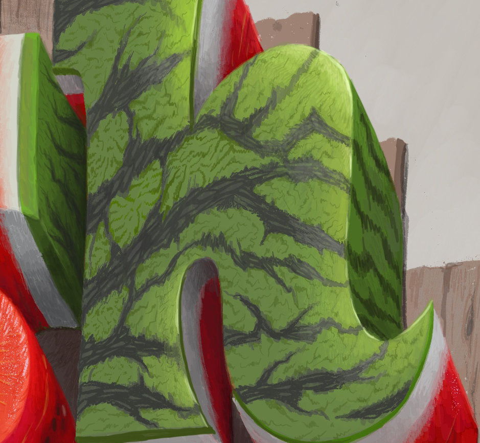
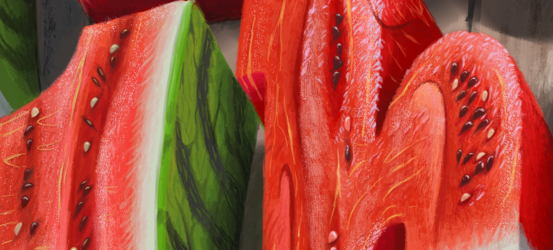
WATERMELONS
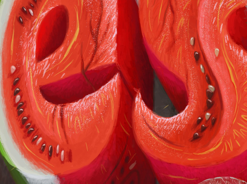
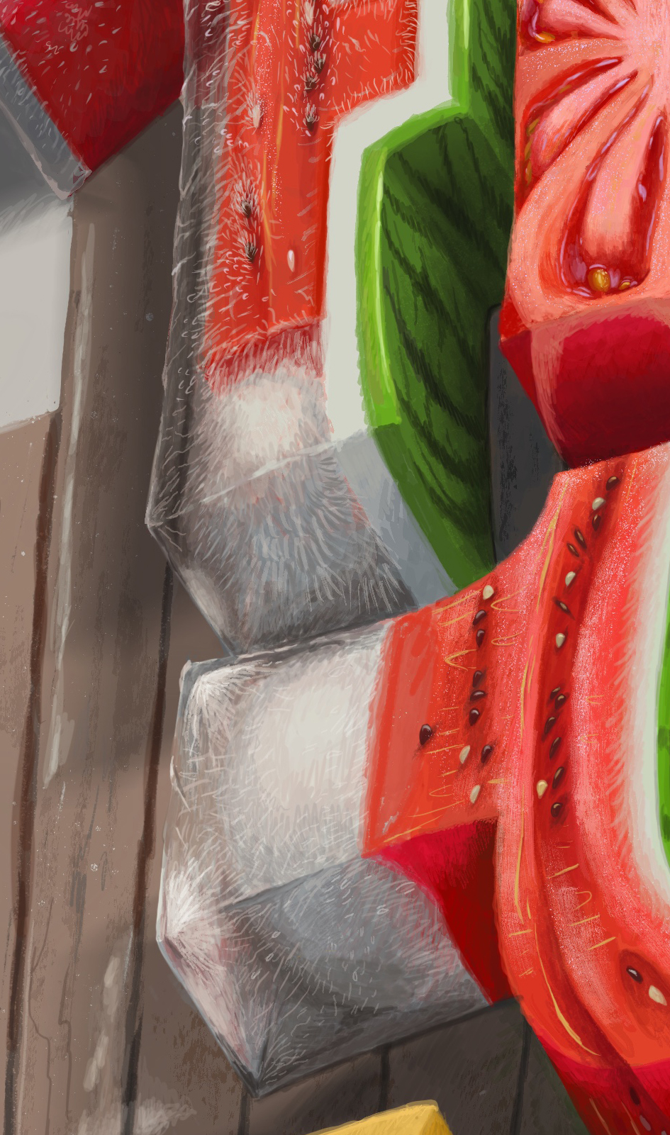
The image below shows the lighted and shaded parts of a watermelon. The interior takes more water than the other parts, so it is highlighted when the light shines on.
The succulence and juiciness of watermelon’s interior make the nutrition zone for growing seeds. It also creates a special fragrant, stimulates animals to come and eat, even the seeds. Seeds will not die through the digestive process and be dispersed everywhere.


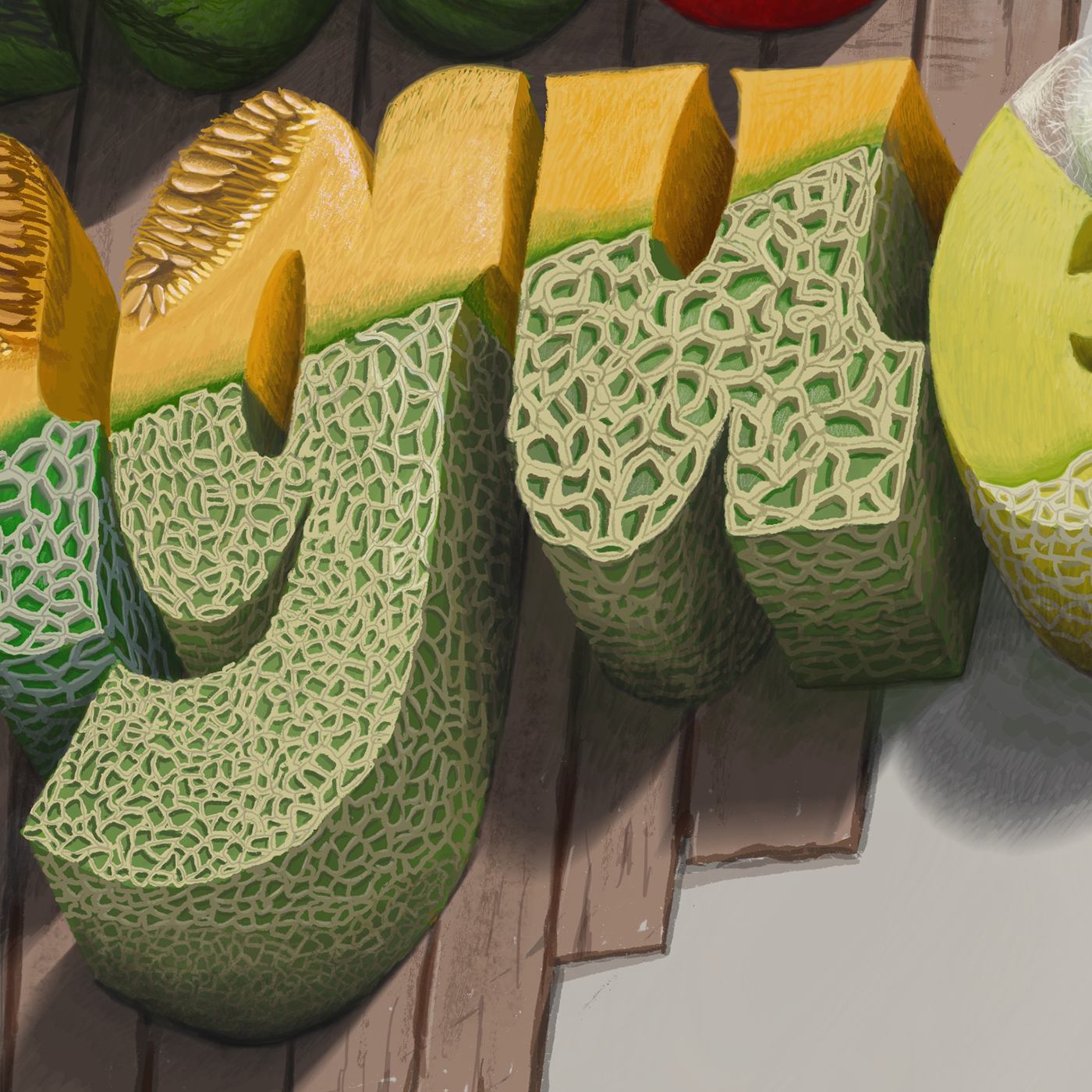
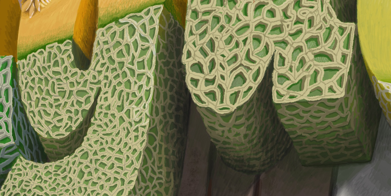
MELONS
The striped texture part of the melon is carefully drawn in detail by hand. The body is not succulent and has scratched textures due to the well-defined fiber structure has completely described.
Each letter has a slight difference in peel material, and the core is not exactly the same, creating a uniformity without being boring.


Constructing a piece of peel


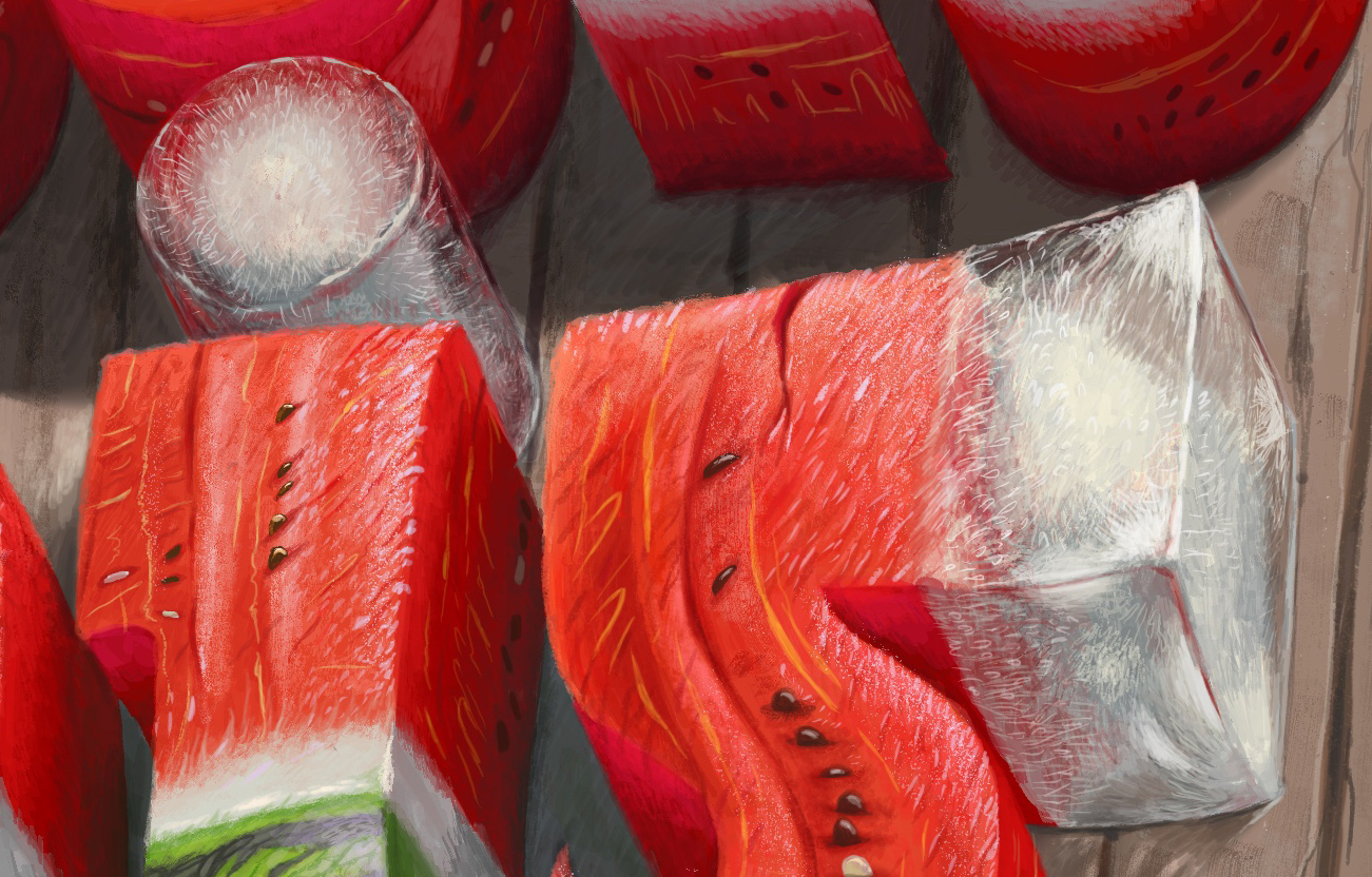
THE ICES
ICE CUBE has little air bubbles inside the ice core. The outside is hard during freezing, while the inner core shrinks quickly and reduces the volume, causing this phenomenon
Besides, ICE CUBE also has tiny cracks created by particulate matter deposited in water due to impure water, highlighting the opaque inside.


2.COLOR & TYPOGRAPHY
COLOR ARRANGEMENT


The drawing’s primary colors are red and green. They have a sharp contrast but still positive and tropical, along with the transparency and ice’s whiteness softens the red color. The support colors provide a gentle, neutral tone, but with about 40% volume of the total color, it makes the main color look better. It also helps to add sub-contrast, hot-cold, saturation, and desaturation to an equally strong enough for very vibrant colors in this art.
LETTER STYLE & LAYOUT

Slightly diagonal layout but still has a curvature, the font is more harmonious, even though it’s in the bold setting.
We can see letters are in fat, which is due to the elimination of aggressive straight lines and extremely squares angles. The letters are in the lowercase state, with an initial capital letter in a high readability level.
Fresh this tongue in a nutshell ?
Pinch to zoom
(this version is fixed in PC or laptop browser with the high quality. But when you are in the Mobile or the Tablet mode, you can pinch to zoom the smaller detail)