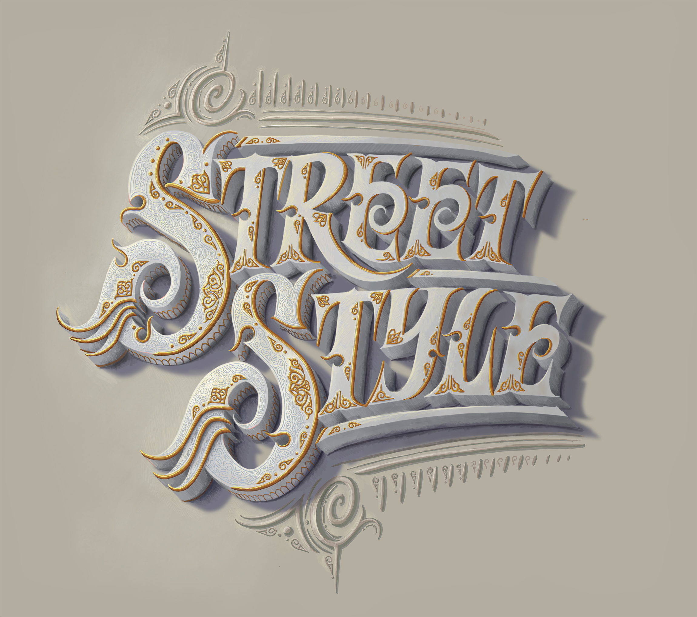
STREET STYLE
IMPERIAL ELEGENT
It is imbued with classic colors with renaissance highlights, gold details, and carvings immersed in each letter. However, the sharp and neat strokes make Street Style also bring an equally modern appearance.
Pinch to zoom
OVERALL DECORATION
1. LETTER'S INNER DESIGN
We can recognize a certain depth of each stroke through the division into 3 main parts: Main decoration, Smaller decoration, and Inner pattern.
The Borders cover the corners. The gold-engraved curves not only help protect but also enhance the decoration of the letters. Ground covers are straight-knit patterns that support the letters to stand firm on the ground.


2. GOLDEN DECORATION
There are 3 primary levels of Decoration. The biggest part – MAIN DECORATION is a lotus symbol with knitting lines and curves inward. The remaining 2 levels are much smaller in volume to complement the main part and embellish the letter’s narrow spaces.
FOOT COVER is the specific feature placed in each Serifs section to increase stability and decoration.


Every golden DECORATION is meticulously finished by hand. They are carved separately to match each stroke of the letter, including:
- Light setup
- Highlights
- Reflection
- Side Shadow
- Dropped shadow
TYPOGRAPHY
1. LETTER STYLE
A hand-crafted typeface helps it and the details work well together.


2. LAYOUT & SLANT ANGLE
A small tilt of 10 -15 degrees to the right of the word makes the text line smoother. Human hands tend to be inclined to the right in the handwriting, so having the small angle in the word increases the intimacy and friendliness, avoiding the feeling of being too mechanical.
The main layout is solid red curves that imply a soft balance with the already angular strokes. This curvature makes it also in harmony with the slant angle for a high readability level.


3. STACK LEVEL
To create depth in drawings in general and details in particular, it is usually divided into 3 levels of a detail: main level, intermediate level, and support level. Each level is assigned very clearly.


The example is about 1 – 2 – 3 blue color that corresponds to the letter face – side face – letter shadow, 3 levels to create the depth of every single letter. Similarly, orange has 1: letter, 2: background, and 3: background decoration.
They are also categorized into 3 different levels that help us identify the layers as letters, backgrounds, and decorations. This stack level is not only displayed by shape, but also by color and style.
And here is it, one more time
Pinch to zoom